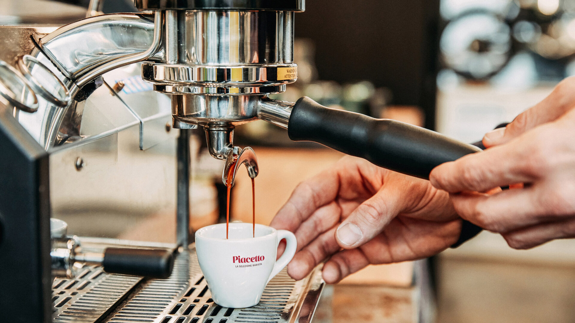
The Italian flair of the Piacetto brand, which exclusively targets modern gastronomy, was to be interpreted in a new and contemporary way. The new brand story focused on the expertise and passion of Italian baristi, and was refined and formulated on the basis of user stories and with a view to the competition and the market.
The starting point for the rebranding was the brand's product promise: Piacetto is the caffè that Italian baristas prefer. This becomes an integral part of the word/figurative mark under the new slogan "La Selezione Barista."
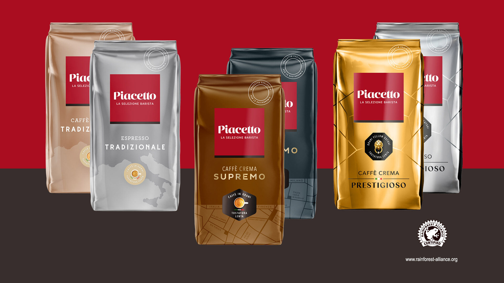
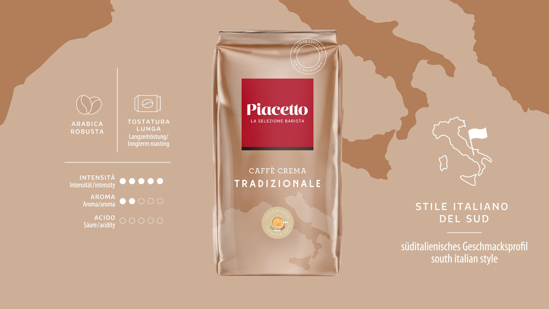
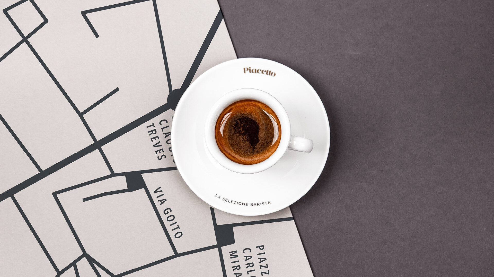
Further elements of the new brand story are visible in the imagery and packaging. Stylized maps on the packaging of the different product lines place a varied focus on Italy and the places where the best Italian caffé can be discovered. Supremo, for example, represents the typically elegant flavor profile of northern Italy.
Services:
Packaging, slogan development, logo development, brand story, brand design, visual language, PoS concept
Word/figurative mark
With the modernized lettering, a bolder brand color and changed proportions, the revised logo creates a striking visual identity.

"With our new partner LIGALUX, we have consistently focused on excellent design and in-depth consultation. The goal was and continues to be the careful evolution of the brand by strengthening the brand core with an eye on the spirit of the times. Right from the start, LIGALUX impressed us with their deep brand understanding and inspiring design."
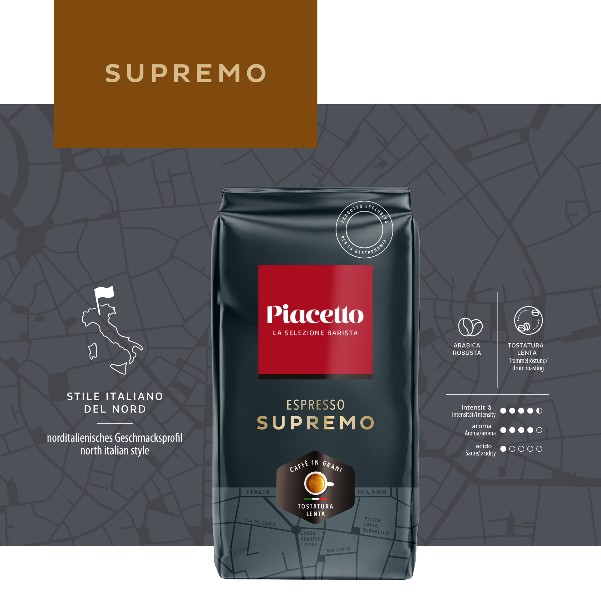
Packaging
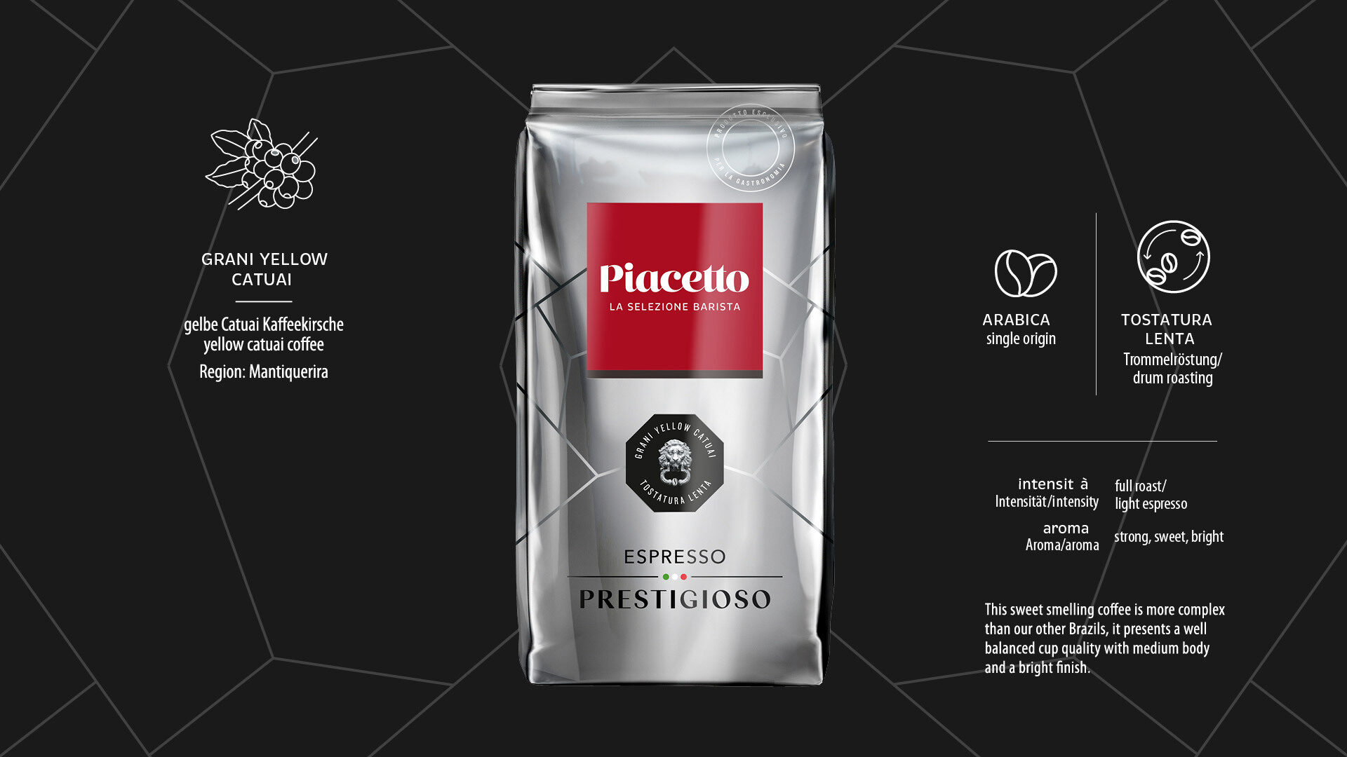
In consideration of the varying price points of the Tradizionale, Supremo and Prestigioso product lines, the color scheme, typography, and graphic elements were redefined for the packaging. This means that the style of the map sections also varies, giving each product line its own character.
Das stringente Markendesign bietet Raum für differenzierende Produktliniengestaltung

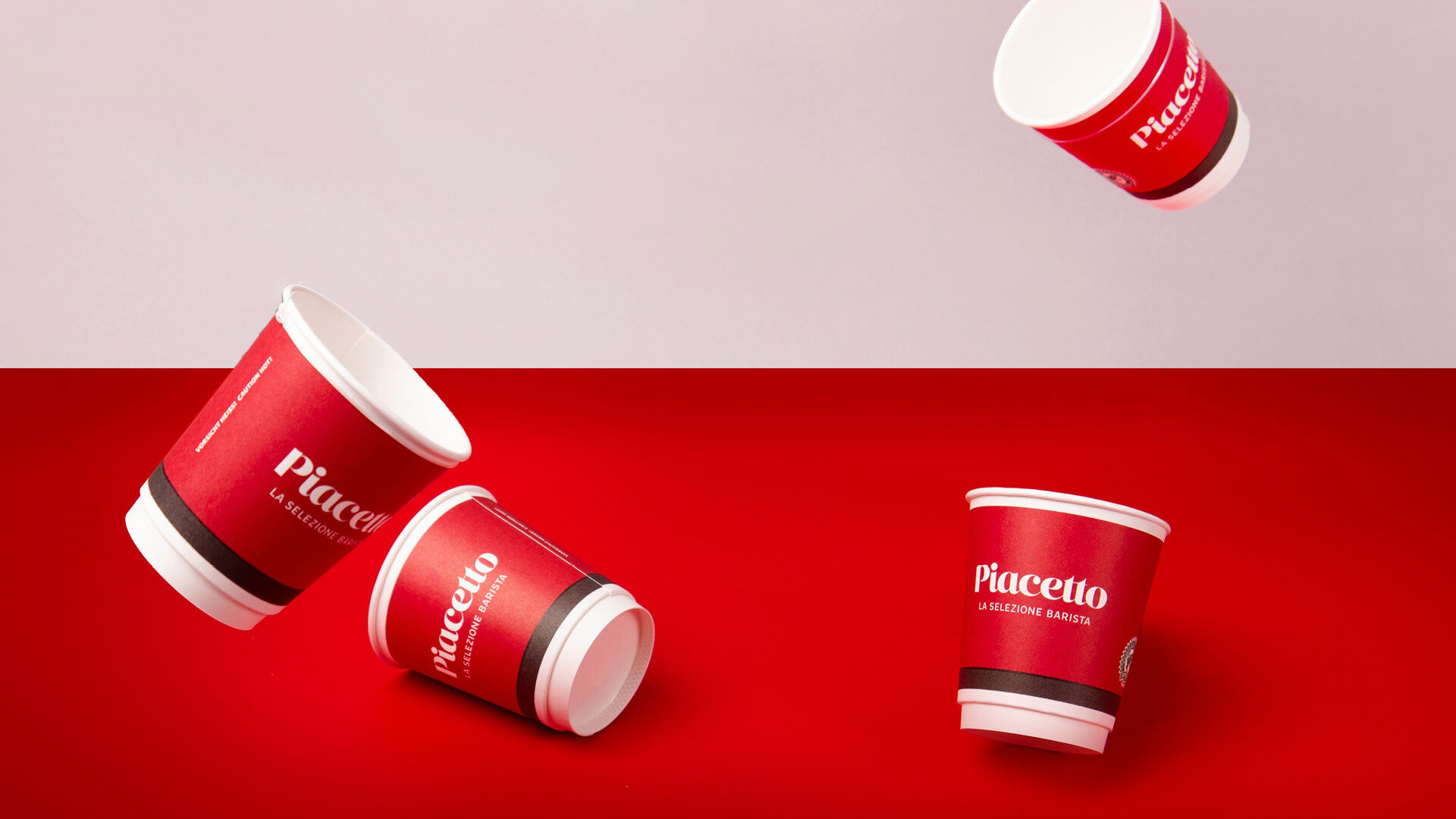
Piacetto is a brand of Tchibo Coffee Service GmbH, which supplies corporate customers with everything from coffee and tea specialties to all-in-one coffee-serving solutions.
