The global pharmaceutical company medac has repositioned itself for the future, and Ligalux is managing the company's new visual corporate identity. Together with our strategy unit, fischerAppelt advisors, and our digital agency Fork, Ligalux was able to realize the brand transformation for medac. The goal of the integrated collaboration was to modernize the brand's image, emotionally charge it, and thus strategically position it strongly in the international competition.
medac is a reliable partner that considers health as the highest good of people and continuously advocates for it. This inner attitude is encapsulated in the new brand claim "improving human health" and is conveyed in the new corporate design.
Services:
Brand architecture, claim, logo development, brand design, brand communication, photoshoot, employer branding, brand book, literature concept, campaign.


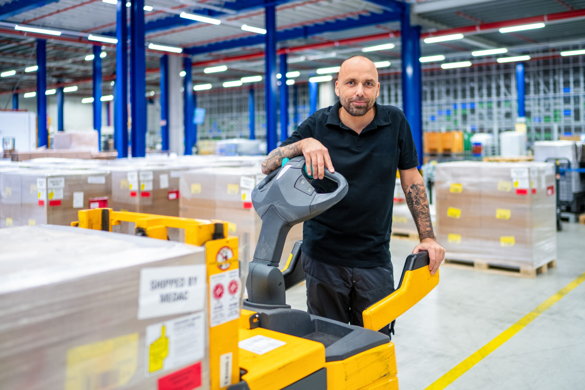
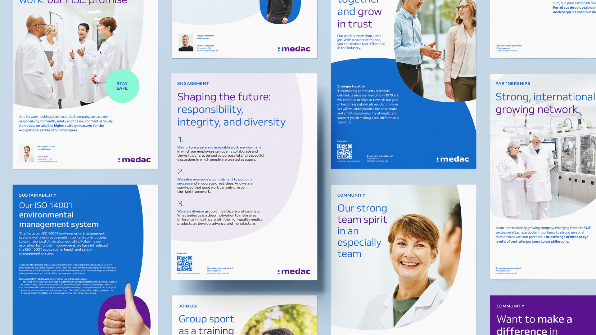
Employees embody the new claim
The claim "improving human health" is reflected in the people shooting. The dedicated employees are shown in authentic work situations from research and development to production and packaging, and are the focus of the cross-site shooting.
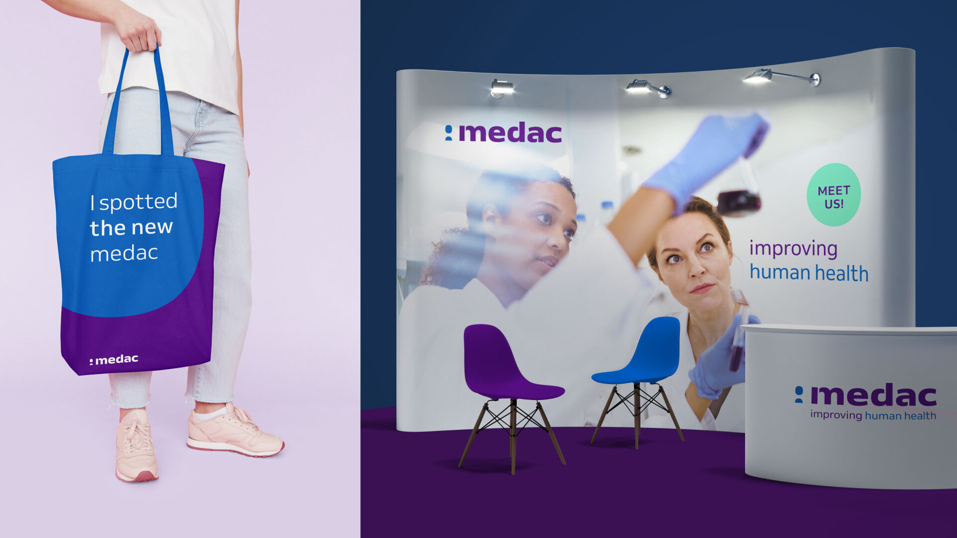
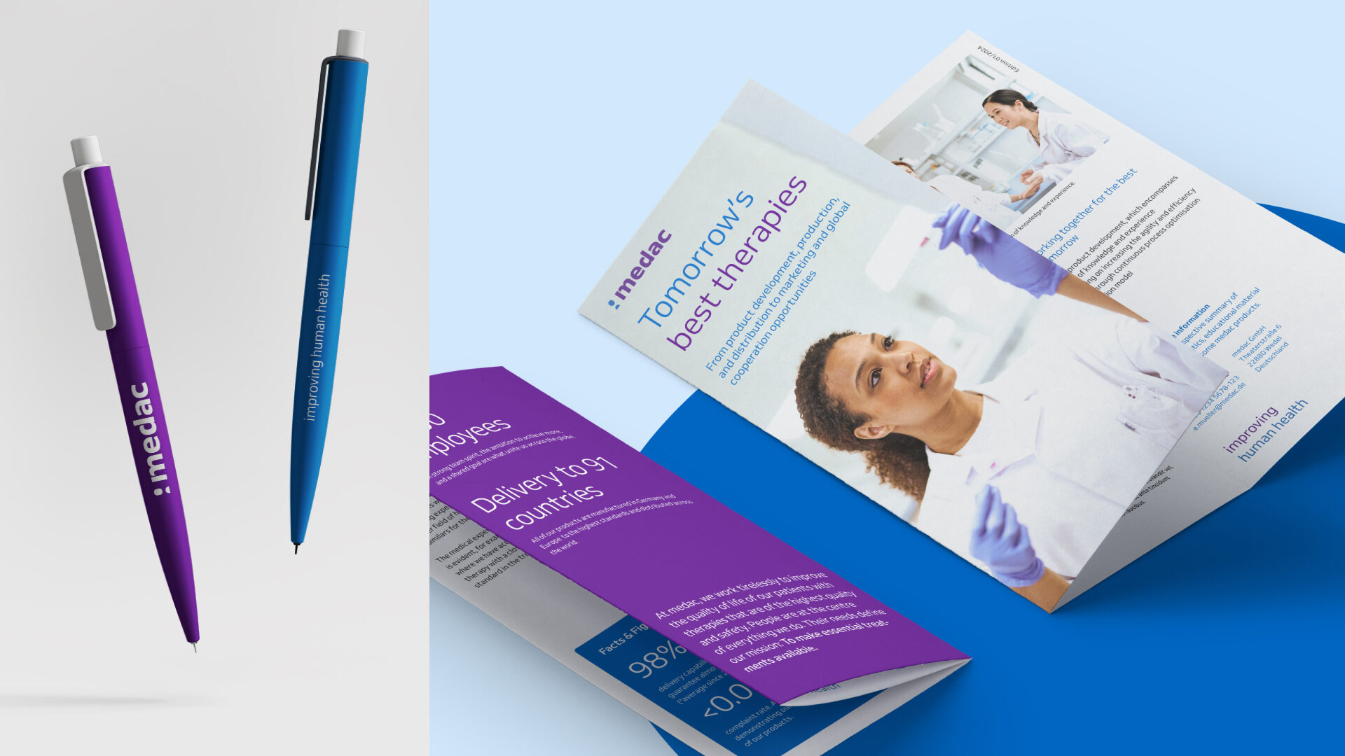
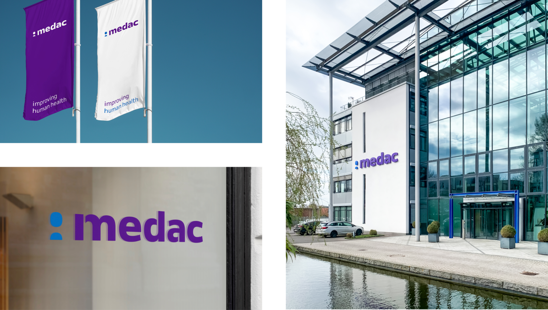
From drop to logo
The logo is based on the droplet shape of a solution, representing medac's drive to improve approved medications and develop innovative therapy options. An open typeface, bold letters, and contrasting strokes in the logo design convey progressiveness, vitality, and maximum market impact. Rounded corners complete the brand's look and give the new appearance a soft, human appeal.

Scalable brand
Flexible design principles, combined with the drop element, form a comprehensive design system that extends across both analog and digital touchpoints.
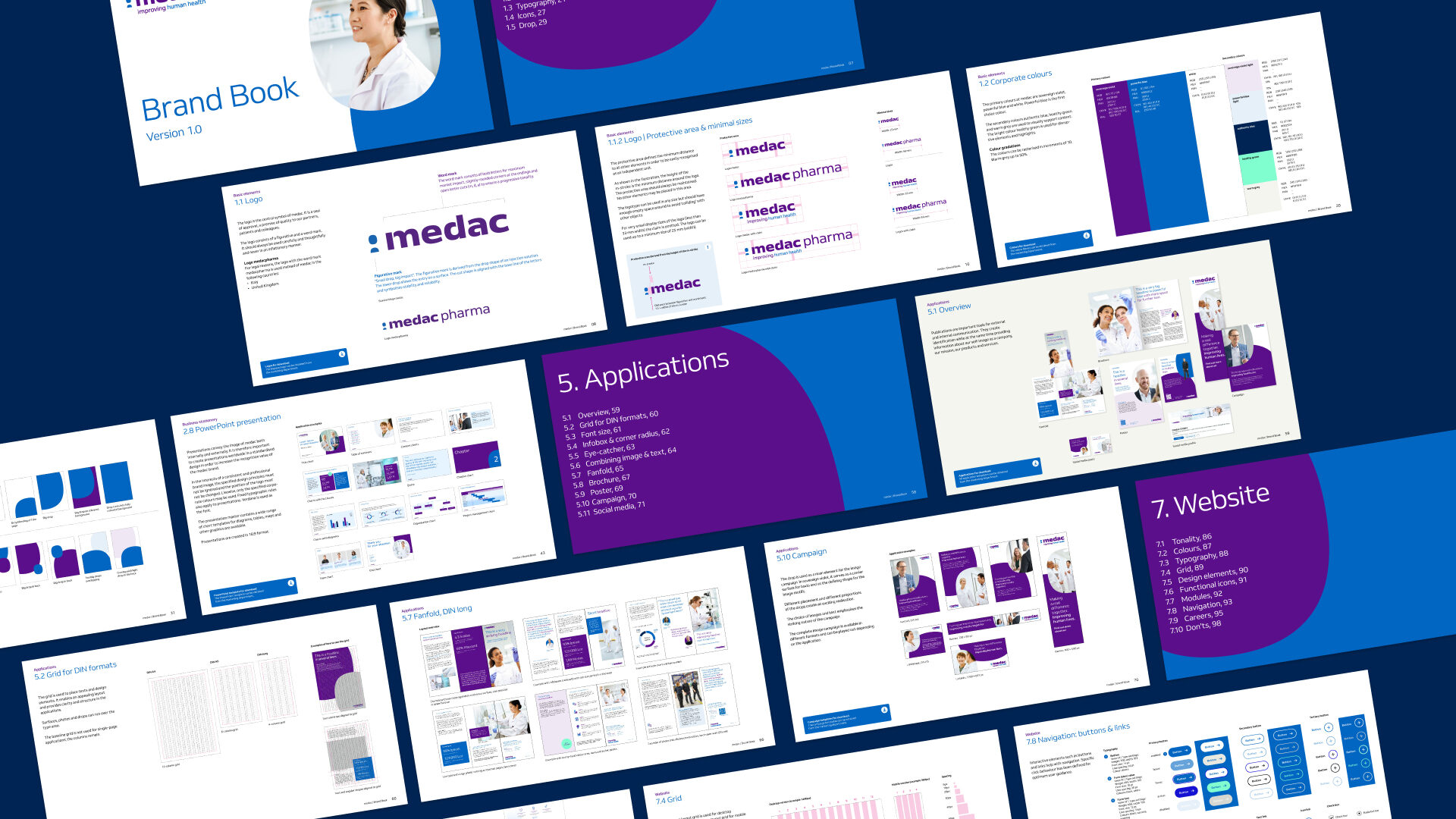
Brand consistency across all channels
For globally consistent brand management, all applications are anchored in the digital brand book. This serves as the central set of rules for using the new visual identity. It ensures that all employees and service providers have access to various design and marketing templates. Thus, the brand is present everywhere, and its consistency is maintained.